I usually am a themed classroom girl. Last year was Secret Agent.
The year before that was my favorite: Enchanted Forest.
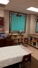
This year I switched to 3rd grade and I wanted something that felt a little cozier, homier, and older. More 3rd grade chic. So here are some before pictures.
A lot of great features! Besides being fairly new and well maintained, it had great space. And it really lent itself to a homey feeling. I didn't love the burgundy cabinets, but there was a lot of black that I really liked, and I loved the window with the space around it.
So here are some afters:
This little corner became a reading corner
here:
I need a cute little chair for the corner.
This smart board wall became this:
The rules
A little gift for the first day! I wrap up all the books in curling ribbon like a gift. Then we open our gifts and go through each book one by one, discuss what it is for and what we will learn, and then put it away in our desks.
A space by the window went from this:
(I brought the pillows, lamp and rug in)
To this reading corner:
Before:
So there's a little preview. I sometimes miss having a theme. But it's a very calming room. The blue is actually a teal color, not quite as blu-ish. On the first day one of my students told me it looked like a hotel! I'm not sure if he meant it as a compliment, but I'll take it!
I always make all my own decorations. I had to completely change my plan this year because I didn't have access to colored ink, and couldn't afford to make a bunch of colored prints at Staples. So I did the best I could with black and white. I figured it was cheaper that way, and I could always just use the copier for some things.
I always say decorating is in the details. More details to come at a later time. Thank you for looking!
[Glitterfy.com - *Glitter Words*]


Wow! This is a great post. Thanks for your wonderful article! I think this is valuable and useful to us.
ReplyDeleteaged care cleaning brisbane